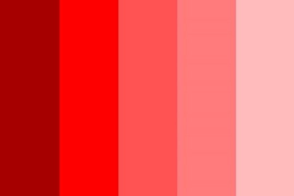
Red - rage or intimacy?
Although often representative of aggression – blood, fire, heat, rage – reds are a diverse palette encompassing more positive associations such as passion and energy. Red is provocative, attention-grabbing, and sometimes, in its deeper tones, even sensual. Its lighter tones can convey an intimacy that is not necessarily carnal, however, as pinker tones evoke the jolliness of blushed cheeks, or the warmth of a happy heart. From aggression to intimacy, red palettes contain a diversity of choices and meanings to choose from.
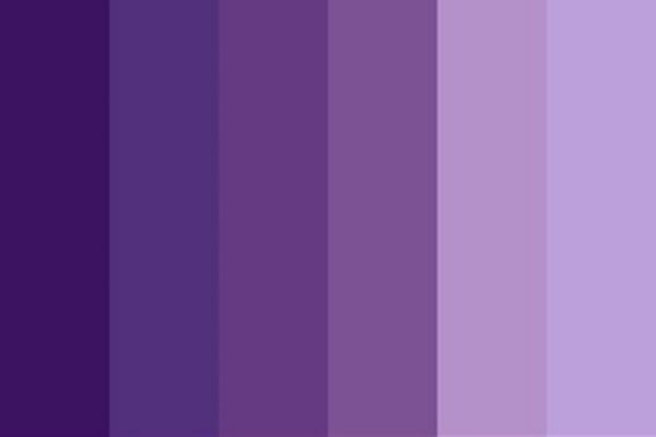
Purple - supernatural royalty?
Historically associated with royalty, perhaps due to its relatively rare occurrence in nature, purple is regal, sophisticated, and spiritual. Its somewhat supernatural status (especially its deeper tones) makes it a colour which conveys a sense a mystery, too, or something that has been lost to time: something nostalgic or ephemeral. Its lighter tones come across as less spiritually intense, and more calming: the visual accompaniment to the emollient scent of lavender. From the highest royalty to the modest atmosphere of a lavender garden, purples contain a versatile palette to choose from.
Blue - from sea to sky
Global surveys show that people most commonly cite blue as their favourite colour (colour me guilty, for I’m one of them), and as such blues are dependable, confident, and trustworthy. Appearing regularly in nature – e.g., the sky – it is a colour that is both calming and habitual, like a well-established morning routine. For these reasons, mid-tone blues are the choice of most social media logos and platforms. Deeper blues find themselves most often in academic book cover designs, as its evocation of the ocean’s depths suggests a similar kind of profundity to the work inside. Whether evoking sea or sky, blue seeks to reassure, and is a popular colour choice as a result.
Green - nature and wealth
The predominant colour of both nature and money, green has diverse meanings and associations: wealth and prestige, but also serenity, generosity, and health. It is grassy, earthy, the colour of nutritious foods, and evocative of the casualness of life on earth. Its lighter tones suggest safety and familiarity, while its darker tones suggest a rootedness or security, like a forest’s undergrowth. While its associations to nature remain strong, it can also signal security in terms of wealth; unlike a royal purple, green’s familiarity and commonness in nature result in a more modest representation of prestige.
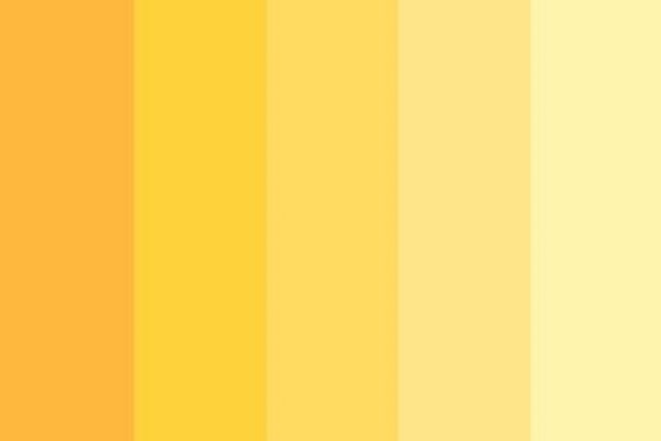
Yellow - a vibrant choice
Bright, sunny, vibrant, yellow exudes warmth and positivity. It contains all the fun-loving connotations of a sunny day as well as the creative energy and motivation our mighty sun bestows. The colour of natural sunlight, yellow suggests an unforced and naturalised creativity that is simultaneously intense and laidback. Its lighter tones, approaching cream, can convey the sophistication that comes from being approximate to white, while still maintaining a positive, welcoming glow. Darker yellows, approaching orange, are more exuberant, as the saturation compounds all of its associations more intensely.
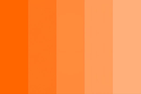
Orange - energetic or laidback? (spoiler: both)
Like the fuzziness of peach skin or the fizzy nutritiousness of a vitamin C tablet in water, orange suggests exuberance, playfulness, and vitality. It conveys a more lowkey, contented glow than a vibrant yellow, as it contains a range of tones found in late evening sunsets, while its lighter, sandstone tones paint a picture of bustling rustic life. It is laidback without being lazy, bright without being overwhelming – a lovely choice for any palette.
Brown - earthy and simple
The colour of earth, browns are natural, simple, and durable. They convey the comfort and softness of feeling the earth beneath your feet, or indulging in a luxuriously smooth bar of chocolate - especially in its deeper, richer tones. It is luxury without royalty, and comfort without brightness; like the simple rusticity of a log cabin, it conveys a modest warmth. Browns also suggest simplicity by their association with various skin tones – a stripping back from all the multicoloured choices of fashion down to essential components. Brown is a noble choice without haughtiness, simple without being simplistic.
Black - versatile yet fashionable
Time to go dark-sided. Blacks are timelessly sophisticated, as suggested by the well-known adage ‘___ is the new black.’ They convey a fashionable elegance as well as the associations of prestige and power that go along with it. Simple yet domineering, black suggests no-nonsense value; it is a statement straight to the point about one’s worth. Its lighter tones into grey are perhaps less confrontational, more aged and refined, yet retain black’s sophistication and prestige. Other options from this palette include blue-black, a more calming and approachable tone which retains all of black’s sophisticated and prestigious connotations.
White - Classic, but also cosy
The colour of antiquity’s classical sculptures (at least, after the paint wore off), white connotes purity, nobility, cleanliness, and softness. It has long been associated with the pure light of heaven, angels, God, and moral goodness. Because white is easily stained, it conveys cleanliness and purity in both a literal and metaphorical sense: it is the traditional meaning behind a bride dressed in white, demonstrating her virginity to all on her wedding day. In more secular areas of life, white relives the experience of lying in clean, crisp bedsheets and soft cotton blankets. It is cosy without brown’s earthiness or green’s naturalness, instead elevated and noble. Its greyer tones express a similar nobility but more aged and refined, slightly weathered in comparison to the bright, new aesthetic of pure white. Light grey and off-white tones can therefore be used more diversely than the intense ethereality of pure white, while still conveying the same elegance, softness, and noble antiquity.
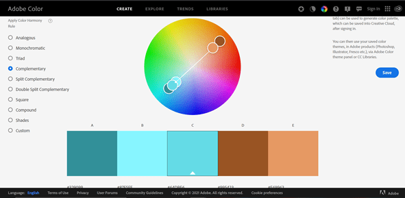
Have you found colours that you like, but are struggling to put them together in a cohesive palette? Visit https://color.adobe.com/create/color-wheel to test out palettes, as well as find complementary, triadic, monochromatic palette options, or even new colour codes altogether. A vital design tool to help you pick the perfect palette.
Written by Maddie Reid - getsocial@melvincreative.co.uk

