Is graphic design your passion? Mine too, and I mean that in the memey-est sense of that phrase. I have a very basic understanding of photo editing and design skills, which hasn’t stopped me from trying to create. Experimentation is key, but there are some simple rules of thumb you can follow that will result in better designs and more refined aesthetics than, say, your average meme.
Let’s talk FONTS
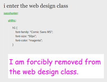
DO: try out stylised and unique fonts, especially for branding purposes. There are so many fonts out there that you have literally no excuse for using a janky font like Comic Sans or a generic one like Calibri. Check out our previous font blog post for ideas, or have a look at any of the websites listed below and find a font that resonates with you or your project.
DON’T: mix fonts, especially radically different fonts. It is a graphic design nightmare. Consistency is key, not only for sculpting out your own personality and/or branding, but also just for legibility. Having to change between fonts can be jarring for your eyes, and adding any extra amount of effort someone has to make just to read your design is a negative. Generally speaking, it is easier to create an aesthetically pleasing piece that flows nicely. Whereas, creating a similar kind of harmony with jarring elements – while possible – takes much more time to learn and master. Stick with the basics for now, though this isn’t to say you can’t scope out two or three fonts you use regularly, perhaps for different purposes. If you are tired of using the same old font, you can research fonts that pair nicely: https://fonts.google.com/ has a 'pairing suggestions' section for each of its fonts that you can test out for free.
How about IMAGES

DO: incorporate images as part of your designs. Of course, be careful about whether you have the right to use them (Google images, you may be surprised to learn, are often not fair use). In all honestly, Google images tend to be pretty low resolution anyway, so unless you’re making a deep-fried meme, I would avoid for that reason primarily. Alternatively, websites such as shutterstock.com have a massive collection of free stock images, vectors, and even video footage. Having your own images bypasses any copyright issues and can add a personal touch, but they’re not always feasible, or perhaps not the quality you’re looking for. If you do use your own images, always ask for permission from anyone who features in them if it is okay for them to be in your design (and for it to be published wherever you intend to publish it).
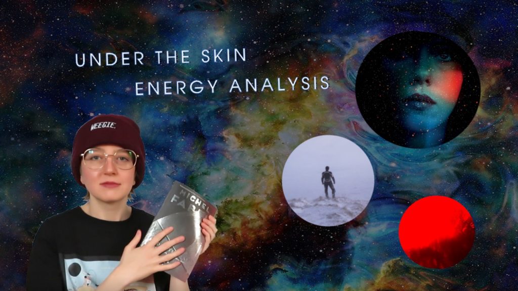
DON’T: overload your design with images. Unless you’re making some kind of statement about the bombardment of imagery and information in postmodernity, the visual chaos emanating from such a design choice is unlikely to work in your favour. Having one impactful image is going to stick with people more than lots of images in one visual space.

This is partly bad because the images are badly edited, but also because there’s too much going on. It's an affront to the eyes.
What about COLOURS
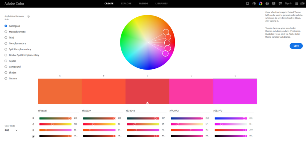
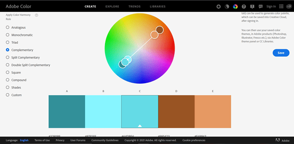
DO: research colour palettes, combos, and meanings. https://color.adobe.com/create is fantastic resource which shows you colour palettes that are analogous to the colour you’ve chosen, monochromatic, triadic, complementary, and split complementary (and more!). I feel that it is often an unhelpful tip to say ‘don’t use clashing colours’ as if that is either objective or intuitive to everyone. This wheel, however, shows you colours that complement each other in different ways. Or, go wild! Choose your own colours and see what you can come up with. Also feel free to peruse our colour blog, which explores what kinds of meanings and associations different colour palettes generally convey; this may help you make a decision of what kind of base colours you’d like to use and then you can springboard off of that into more precise tones.
DON’T: limit yourself to default colours on an editor. Whether you’re using Canva, Photoshop, or paint.net (the cheap – but effective! - photo editor that I currently use), they all have colour tools that allow you to either input hex codes (preferred), have a go at the colour wheel, or use a colour picker that allows you to select a colour you’ve found. There is a world of colour out there to go and explore, why stick to the defaults?
How does SPACING work
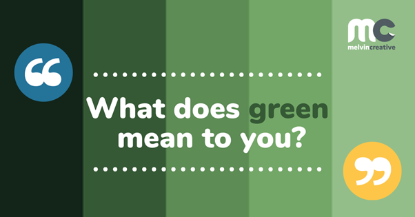
DO: think about spacing; are the letters far enough apart/close enough together to be legible? Are the borders around a text or image equidistant? There are no hard and fast rules; inevitably, there will be components in an image that throw it off balance and equidistance is not always possible. But generally, if you have a piece of text or a logo say, in a corner, make sure the edges have the same amount of space around them. For pieces with more elements, such as the image below, see how there is equidistance between where the ‘W’ sits and the ‘n’ in ‘green’ from the borders of the colour blocks they sit in. This creates a neater effect than simply overlaying the text willy-nilly. These are small details that not everybody consciously notices, but when implemented, they do create a neater, more aesthetically appealing design.


As for the logo, you may have noticed that the borders are not quite equidistant within the colour block it resides in, but this is so that it is not too far up and to the left out of the way, where it would then become disjointed with the rest of the elements (instead, it lines up with the left edge of the yellow circle). I’ll repeat that there are no hard and fast rules; the best thing is to experiment and see what works best for that piece.
DON’T: make your spacing erratic, uneven, disjointed, or too spaced out. The latter is the most common mistake, as it is easy to place elements around the border of your canvas and call it a day. Generally, try to keep things more centralised so they don’t ‘drop off’ the edge of your design. This helps to make the piece more cohesive, as the elements aren’t too far apart.
Conclusions:
Of course, there is a level of subjectivity to all of this: what constituents ‘too far apart’, ‘jarring’, ‘janky’, etc.? I don’t have those answers, but these tips are tried and true, so once you master these, you can then afford to go and break the rules.
If you’re ever tearing your hair out, then fear not, because design lies in that strange area of both simplicity and complication. As art designer Paul Rand once put: ‘Design is the method of putting form and content together. Design, just as art, has multiple definitions; there is no single definition. Design can be art. Design can be aesthetics. Design is so simple, that's why it is so complicated.’ Practice makes perfect, so stick at it – that’s what I’ve been telling myself, anyway!
Written by Maddie Reid
Trends come and go, and the same is true for fonts. It is always difficult to forecast what will be popular, so instead of guessing, we’re going to look at which fonts have already seen a rise in use, and the reasons why.
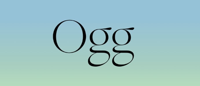
Serif fonts – personal favourite: Ogg
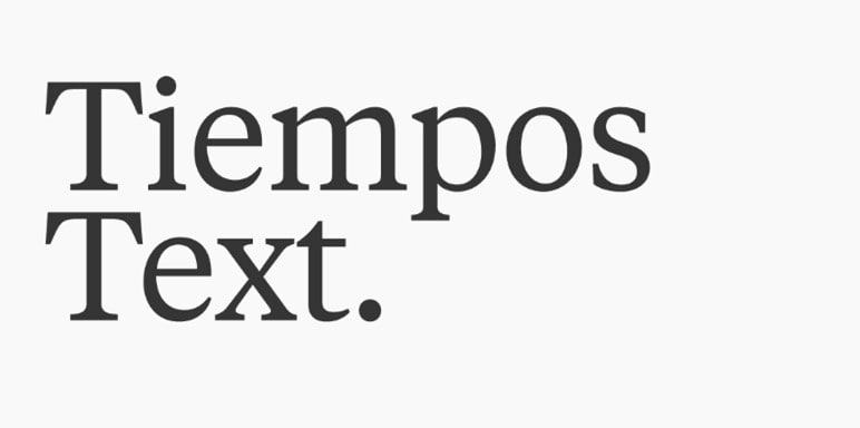
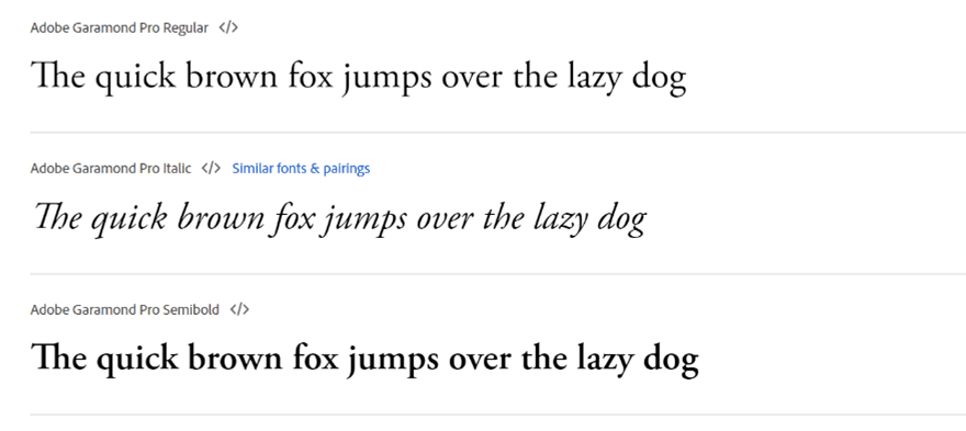
Classic, retro-nostalgic, sophisticated, and flourished, serif fonts are seeing a strong renewal in 2021. They are defined by the little flourishes at the line-ends of letters (see below), and some examples include Ogg, Garamond, Tiempos Text, and the ever-loved Times New Roman. Serif fonts stand out in particular because their flourishing contrasts the simple, minimalist fonts that had previously seen popularity in design circles (remember when we all loved Helvetica?).

Why are they popular now?
Whether you’ve been listening to ‘80s pop revival (favs include anything from Dua Lipa’s Future Nostalgia), watching Stranger Things, Wonder Woman 1984, or really any remake Hollywood has thrown at us in the last few years, you may have noticed a cultural tendence towards retro-nostalgia. While this trend was not necessarily caused by the pandemic, it certainly pushed it to new heights as new cultural production became at times impossible. It’s likely serif fonts are part of this nostalgic current in our culture, but perhaps unlike the colourful neon of ‘80s pop aesthetics, these fonts are more timelessly sophisticated; they suggest an ongoing excellence and commitment to quality. In fact, the origins of serif fonts go back to antiquity: Timothy Samara suggests that the flourishes came about to neaten the letters made by Greeks and Romans when they carved writings into stone (explains the name behind Times New Roman, too).[1] It seems serif fonts will always have a spot because of that timelessness, while our locked-down selves have bolstered their popularity due a desire to escape into the past.
Sans-serif fonts – personal favourite: Futura Now
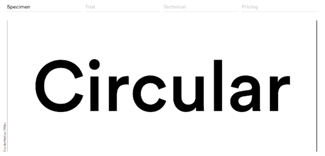
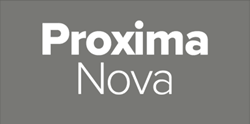
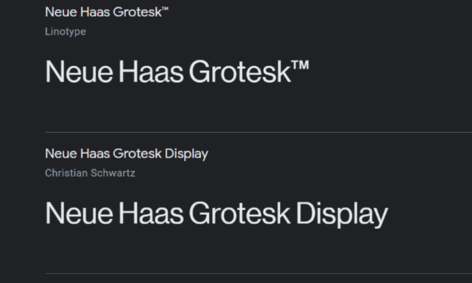
Sans-serif fonts are not a trend as such, as they have seen consistent popularity across the decades. However, there are some exciting sans-serif fonts that are seeing more and more use from designers. Coming from the French sans (‘without’), sans-serif fonts are defined by not having the flourishes of serif-fonts, instead opting for simplicity, modernity, and minimalism. Before becoming known as such, these fonts were often called ‘gothic’ – hence the names behind sans-serif fonts such as New Gothic, Franklin Gothic, and Highway Gothic (not to be confused with Tumblr Gothic, which describes my teenage years). While Helvetica is now too old-school to be considered hip and modern, the latest trend includes exciting fonts such as Neue Haas Grotesk, Circular, Proxima Nova, and Futura Now. Sans-serif fonts have the added benefit of holding up well in low-resolution images, but as high-res technology has become more readily available, the reason for their popularity now is perhaps more complex.

Why are they (still) popular now?
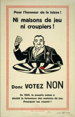
Equally as the pandemic has encouraged us to take comfort in past joys, so too has it pushed us to opt for a better future. Sans-serif fonts recall the avant-garde aesthetics of Futurist circles in the early 20th century (see below: Blast, published 1914) and push towards imagining new types of futures. It is not a coincidence political posters from different decades opt for sans-serif fonts too, either to promote or consolidate recent social changes. For instance, a poster from Switzerland in 1928 uses the font Berthold Block to make a strong case for keeping casinos and gambling houses closed.
Of course, its uses are more diverse than politics, however. In fact, sans-serif fonts have had to fight against the prejudice that their only use was in commercial media: in 1922, master printer Daniel Berkeley Updike claimed they had ‘no place in any artistically respectable composing-room.’[2] Sans-serif fonts therefore position themselves in opposition to tradition, but they can equally be recuperated into capitalist and commercial aesthetics. We will continue to see sans-serif fonts in branding – to suggest ‘we are the future of x industry’ – but also in countercultural media, as different sectors of society reform after the pandemic.

Display fonts – personal favourite: Beatrice Display
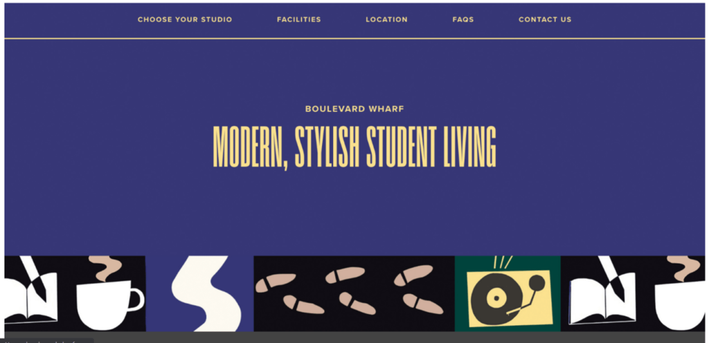
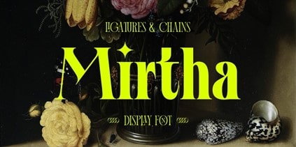
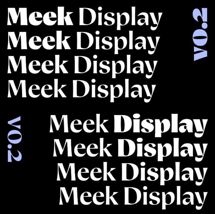
In a world of branding and business, having a punchy, unique font sets you apart from competitors. 2020 saw an explosion of display fonts, defined as fonts that exist as larger headings rather than smaller fonts which can be used for extended passages of body text. Display fonts are relatively new in the history of print because early printing technology primarily sought to accommodate large passages of body text (for instance, the first book made in Europe on a printing press was the Bible – imagine typing THAT in a display font). But now more than ever, display fonts are on the rise, including such beauties as Mirtha Display, Beatrice Display, Degular, and Meek Display. For big chunks of body texts, consistency in the lettering is key for legibility; for display fonts, however, the aim is to exploit and juxtapose the space available when letters are blown up to huge sizes. Note, for instance, the sharp contrast between the widths of the different lines and curves in Beatrice Display: the effect is attention-grabbing, as a header or logo should be.
Why are they popular now?
Digital marketing remains the strongest way to attract new customers, a situation compounded by shop closures and stay-at-home orders. While shopfronts rely on printed fonts, never before has it been easier to adapt and change fonts that exist in virtual spaces. It is often the case that you will see a shopfront or a van that uses Comic Sans – a classic graphic design blunder of a choice, so much so it has acquired cult meme status – but rarely do you see generic fonts for online branding, because it is so easy now to change it. The demand for unique, visually interesting, and impactful fonts, and their increased accessibility and ease, means that display fonts are likely to keep exploding moving into the second half of 2021.


For more (free) resources in choosing the perfect font, visit:
Fonts.google.com
Dafont.com
Fontsquirrel.com
Fontfabric.com
Fontpair.co
Reliablepsd.com/ultimate-google-font-pairings
Written by Maddie Reid - getsocial@melvincreative.co.uk
[1] Samara, Timothy (2004). Typography workbook: a real-world guide to using type in graphic design. (Rockport Publishers), p. 240.
[2] Updike, Daniel Berkeley (1922). Printing types: their history, forms, and use; a study in survivals vol. 2 (1st ed.) (Cambridge, MA: Harvard University Press), p. 243.
From product packaging to social media to visual art, here are some of the top trends in graphic design that have made their way into the cultural production of Glasgow’s best artists and designers.
Serif fonts
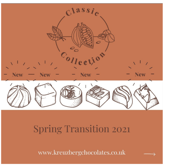
The simple aesthetic of fonts like Helvetica have given way to the more flourished design of serif fonts. More retro than their predecessors, these fonts convey an elegance and meticulousness that is both timeless and classic. It is branding that suggests that being new, hip, or excessively modern is unimportant, but rather that ongoing excellence is a foundation of what they do. In these dark times, retro nostalgia has seen greater prominence across media; the comeback of serif fonts is yet another addition to this phenomenon.
Natural, muted, and earthy tones
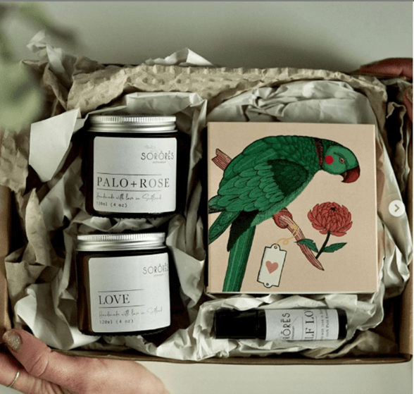
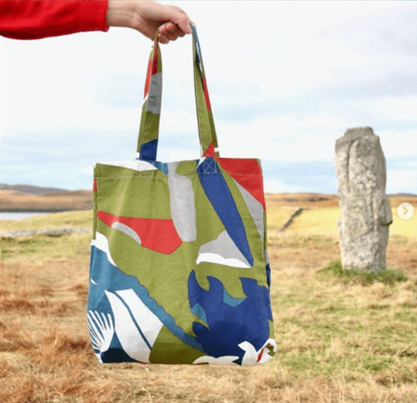
There may be a few reasons for this trend: at last the coming of springtime after a long, dark, isolated winter; the longing to travel to the world’s natural recesses when this has been impossible for so long; or the return to nature for some as lockdown has forced us out of cities and cafés and into the spacious countryside. It could also be how these tones produce a calming, serene effect akin to being in nature, emotions that have been sparse in these anxious times. See how even a colourful bird like a parrot becomes more muted in Sorores Aromatherapy’s packaging, and with more of an emphasis on dusty pink tones. (Also note the serif font – nice). Or see Artichaut Creation’s multicoloured tote bag with earthy greens and muted oceanic blues, with a Scottish hillside serving as both background and inspiration.
Colourful and chaotic designs
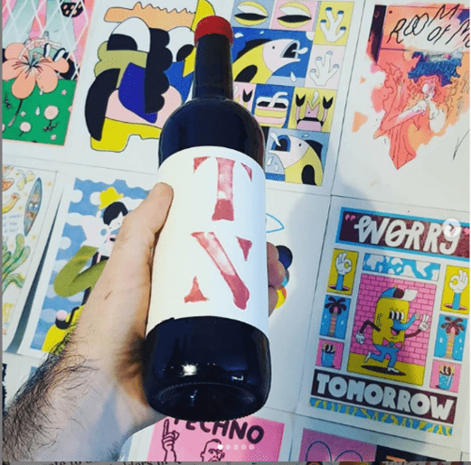
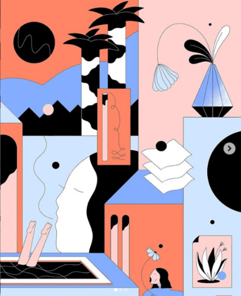
On the flip side, there is an equally strong trend towards the colourful and chaotic, a trend which recalls the more punk and DIY attitude of zines and collage art. This trend sees designs structured almost like comic books, with black-bordered differently coloured squares segmenting each section. It helps convey a kind of narrative as it suggests perhaps not all the elements of the piece are happening simultaneously, but at different poignant moments. This sets these designs apart from the calming vibe of natural and muted tones, and instead delivers punchy, emphatic, and memorable moments all in one visual space. In recalling punk and DIY aesthetics, there is also a gesture towards self-representation by small artists and creators, as well as authenticity and handmade crafts.
Attention-to-detail packaging
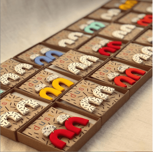
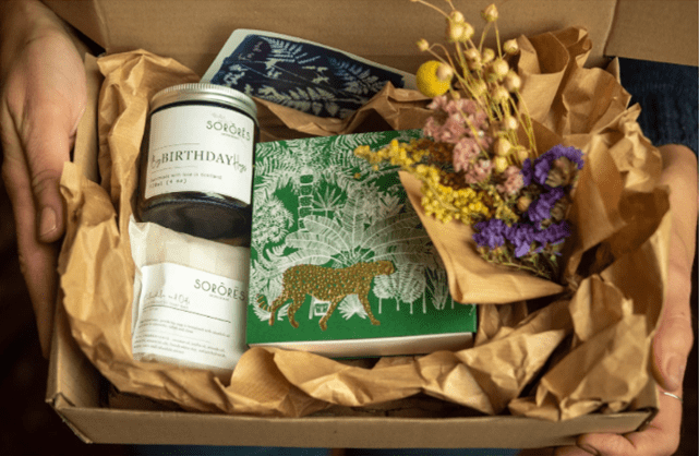
With more people ordering online than ever, creators have capitalised on this by upping their packaging game. Pre-pandemic, it was often the case that customers would have a face-to-face interaction with the seller, but since then there have been large chunks of time where these interactions were not only impossible, but illegal. Check out Sorores Aromatherapy’s packaging which often includes dried flowers, unique card designs, and even pinecones, all neatly presented in a box. Similarly, duststudio’s playful jewellery designs are accompanied by aesthetically complementary packaging: adding a bit of joy to the ritual of opening up packages that have arrived for us.
Self-curated representation
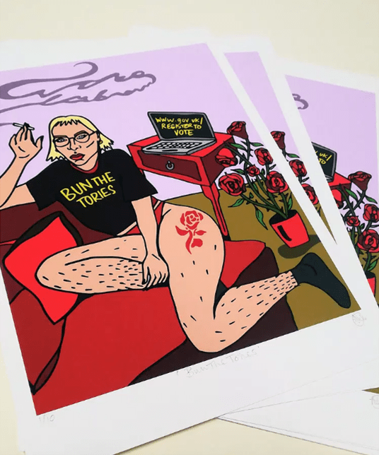
More and more feminist, queer, and anti-racist discourses are entering mainstream political discussion thanks to BLM, MeToo, and an explosion of queer online communities. Consequently, 2021 is seeing a fresh batch of artists looking to represent themselves and their allied communities from their own perspectives. This may come in the form of Molly Hankinson’s work, whose decision to portray women, non-binary people, and women of colour in casual yet assertive ways tells viewers that these groups have always been here, and they’re not going to take any more nonsense. Or in a similar vein, but even more aggressive, is Emily Brooke’s self-portrait titled ‘stop talking’: a bold reimagination of women’s silencing and subjugation into an unignorable, non-willing, and hostile subject. We look forward to more interesting and multifaceted representation in the coming months of 2021.
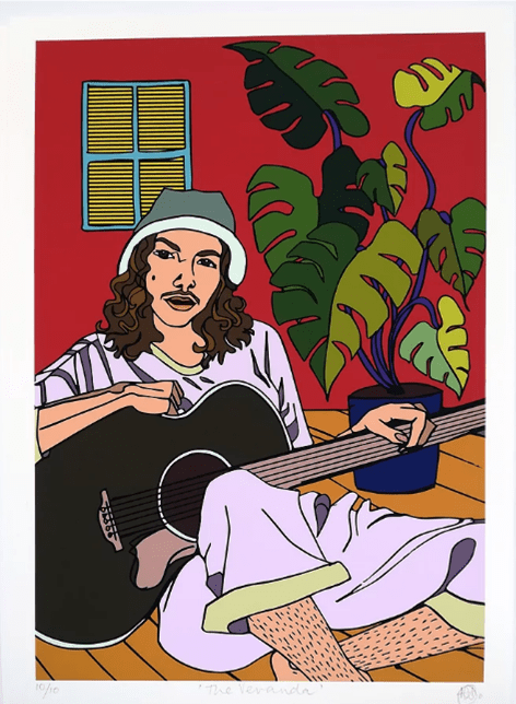
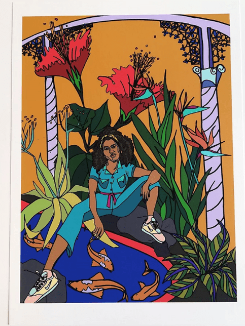
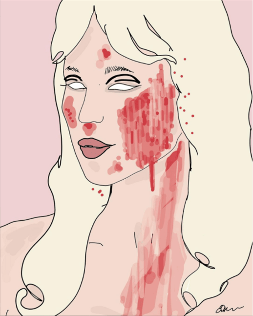
Written by Maddie Reid - getsocial@melvincreative.co.uk
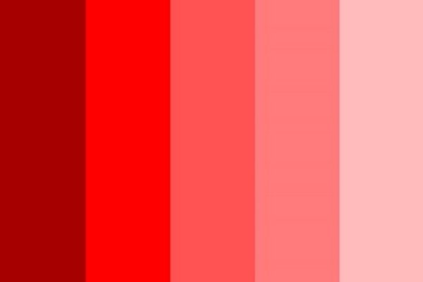
Red - rage or intimacy?
Although often representative of aggression – blood, fire, heat, rage – reds are a diverse palette encompassing more positive associations such as passion and energy. Red is provocative, attention-grabbing, and sometimes, in its deeper tones, even sensual. Its lighter tones can convey an intimacy that is not necessarily carnal, however, as pinker tones evoke the jolliness of blushed cheeks, or the warmth of a happy heart. From aggression to intimacy, red palettes contain a diversity of choices and meanings to choose from.
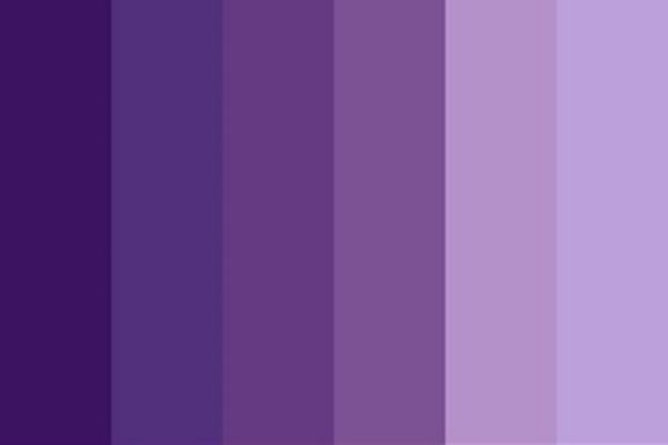
Purple - supernatural royalty?
Historically associated with royalty, perhaps due to its relatively rare occurrence in nature, purple is regal, sophisticated, and spiritual. Its somewhat supernatural status (especially its deeper tones) makes it a colour which conveys a sense a mystery, too, or something that has been lost to time: something nostalgic or ephemeral. Its lighter tones come across as less spiritually intense, and more calming: the visual accompaniment to the emollient scent of lavender. From the highest royalty to the modest atmosphere of a lavender garden, purples contain a versatile palette to choose from.
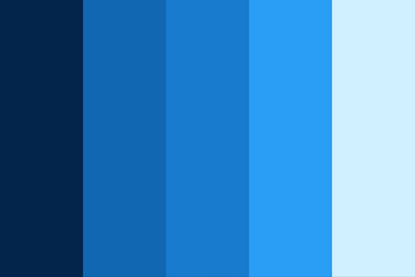
Blue - from sea to sky
Global surveys show that people most commonly cite blue as their favourite colour (colour me guilty, for I’m one of them), and as such blues are dependable, confident, and trustworthy. Appearing regularly in nature – e.g., the sky – it is a colour that is both calming and habitual, like a well-established morning routine. For these reasons, mid-tone blues are the choice of most social media logos and platforms. Deeper blues find themselves most often in academic book cover designs, as its evocation of the ocean’s depths suggests a similar kind of profundity to the work inside. Whether evoking sea or sky, blue seeks to reassure, and is a popular colour choice as a result.
Green - nature and wealth
The predominant colour of both nature and money, green has diverse meanings and associations: wealth and prestige, but also serenity, generosity, and health. It is grassy, earthy, the colour of nutritious foods, and evocative of the casualness of life on earth. Its lighter tones suggest safety and familiarity, while its darker tones suggest a rootedness or security, like a forest’s undergrowth. While its associations to nature remain strong, it can also signal security in terms of wealth; unlike a royal purple, green’s familiarity and commonness in nature result in a more modest representation of prestige.

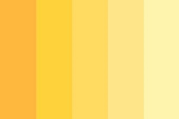
Yellow - a vibrant choice
Bright, sunny, vibrant, yellow exudes warmth and positivity. It contains all the fun-loving connotations of a sunny day as well as the creative energy and motivation our mighty sun bestows. The colour of natural sunlight, yellow suggests an unforced and naturalised creativity that is simultaneously intense and laidback. Its lighter tones, approaching cream, can convey the sophistication that comes from being approximate to white, while still maintaining a positive, welcoming glow. Darker yellows, approaching orange, are more exuberant, as the saturation compounds all of its associations more intensely.
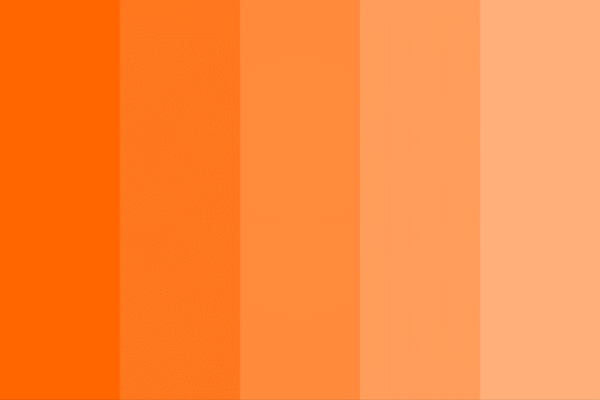
Orange - energetic or laidback? (spoiler: both)
Like the fuzziness of peach skin or the fizzy nutritiousness of a vitamin C tablet in water, orange suggests exuberance, playfulness, and vitality. It conveys a more lowkey, contented glow than a vibrant yellow, as it contains a range of tones found in late evening sunsets, while its lighter, sandstone tones paint a picture of bustling rustic life. It is laidback without being lazy, bright without being overwhelming – a lovely choice for any palette.
Brown - earthy and simple
The colour of earth, browns are natural, simple, and durable. They convey the comfort and softness of feeling the earth beneath your feet, or indulging in a luxuriously smooth bar of chocolate - especially in its deeper, richer tones. It is luxury without royalty, and comfort without brightness; like the simple rusticity of a log cabin, it conveys a modest warmth. Browns also suggest simplicity by their association with various skin tones – a stripping back from all the multicoloured choices of fashion down to essential components. Brown is a noble choice without haughtiness, simple without being simplistic.

Black - versatile yet fashionable
Time to go dark-sided. Blacks are timelessly sophisticated, as suggested by the well-known adage ‘___ is the new black.’ They convey a fashionable elegance as well as the associations of prestige and power that go along with it. Simple yet domineering, black suggests no-nonsense value; it is a statement straight to the point about one’s worth. Its lighter tones into grey are perhaps less confrontational, more aged and refined, yet retain black’s sophistication and prestige. Other options from this palette include blue-black, a more calming and approachable tone which retains all of black’s sophisticated and prestigious connotations.

White - Classic, but also cosy
The colour of antiquity’s classical sculptures (at least, after the paint wore off), white connotes purity, nobility, cleanliness, and softness. It has long been associated with the pure light of heaven, angels, God, and moral goodness. Because white is easily stained, it conveys cleanliness and purity in both a literal and metaphorical sense: it is the traditional meaning behind a bride dressed in white, demonstrating her virginity to all on her wedding day. In more secular areas of life, white relives the experience of lying in clean, crisp bedsheets and soft cotton blankets. It is cosy without brown’s earthiness or green’s naturalness, instead elevated and noble. Its greyer tones express a similar nobility but more aged and refined, slightly weathered in comparison to the bright, new aesthetic of pure white. Light grey and off-white tones can therefore be used more diversely than the intense ethereality of pure white, while still conveying the same elegance, softness, and noble antiquity.

Have you found colours that you like, but are struggling to put them together in a cohesive palette? Visit https://color.adobe.com/create/color-wheel to test out palettes, as well as find complementary, triadic, monochromatic palette options, or even new colour codes altogether. A vital design tool to help you pick the perfect palette.
Written by Maddie Reid - getsocial@melvincreative.co.uk
We’re back to tell you about the past month at Melvin Creative. It’s been a varied month for us, as we got out from behind our desks and went out into the big and (as it turns out) not-so-bad world of networking. And it wasn’t just because of the Fortnite blackhole.
To B2B or not to B2B?
So first off, I (Michael Melvin, blog-writer in chief at Melvin Creative) joined the B2B Glasgow pilot project, a business development group set up by Colin McDermott (he of over 11,000 connections on LinkedIn fame!). The project’s aim is to provide a platform for business owners to share ideas, discuss issues and help each get to where we want to be with our respective businesses. All with a friendly supportive group helping us along the way. Check it out at theb2bclub.co.uk
At the time of writing we're about six weeks in to the B2B project. We catch up each week with a group video chat over ZOOM. We talk about our week and are set tasks to complete before our next chat. This could be, for example, getting back in touch with five clients who have been quiet for a while, or considering recruiting freelance or part-time staff to free up time to let us concentrate on work rather than admin. I’m pleased to report that I’m staying on top of my homework and it's going well so far – stay tuned for more updates each month!
If you're interested in getting into the world of networking, you can get in touch with Colin directly and try out one of the B2B networking events: colin@theb2bclub.co.uk
Flying with the Windmill Hill Dragons
We are also delighted to tell you that Melvin Creative are the proud sponsors of the Windmill Hill Dragon's Football Team for season 2019/2020. Windmill Hill are part of the Merseyside and Halewood league. Although MC isn’t based in the North-West of England, we do have business connections there. We have provided their season's kit, and we’re pleased as punch to report that the Dragons are already top of the league.
…And brewing up some business
True to this month’s theme, I also attended the Glasgow East End Connections networking event at Drygate Brewery. Drygate is in one of the oldest parts of Glasgow, next to Tennent's Brewery. And last month it was home to more than the usual craft brews and bottles: newcomers (like me!) and members/non-members of Glasgow EEC alike gathered to share their stories and businesses. Members and premium members get between five minutes and 20 seconds to present their businesses to you, while non-members get to dip their toes in the water with a ten-second elevator pitch (which was much harder than you may think!). It was fantastic hearing about the diverse businesses in Glasgow’s East End while enjoying friendly atmosphere and plenty of tea and coffee. Will I join? Possibly. Will I go to the next one? Definitely!
If you think this event might be one for you, get in touch Fiona Colbron-Brown, Founding Director of East End Connections (glasgoweec.co.uk).
And that’s you all caught up on this month at MC! Until next time.
If there’s one thing that most creative or digital agencies have in common, it’s that one of the last things to get done is your own website. Between designing websites for clients or creating logos, reports, packaging and what have you, there just isn’t time for doing the in-house stuff. It often gets pushed back to make way for projects that pay the bills.
But the more observant among you will have noticed that this here blog on this here website is our blog on our very own website. The Melvin Creative website is live at long last. It’s packed full of case studies and reviews to make us blush, as well as more info about what we do. We couldn’t be more pleased with it.
And with this great website comes great responsibility. Each month, we’ll be setting aside time to update you on what we’ve been up to. We’ll share behind-the-scenes looks at projects we’ve been working on, from concept to artboard to publication. We’ll also tell you what we’ve been doing outside the office – be it networking events, or be it community involvement and mentoring projects.
We’ll also take it upon ourselves to write the occasional how-to post. Maybe you’ll learn something, maybe we’ll learn something. Got any questions about our work, or the creative industry? Put them in a comment below, or an email, envelope, carrier pigeon, whatever, and send them to us. Maybe you’ll find your answer in a future blog post.
So, here goes. See you next month!